
I recently had the pleasure of working with the internal design team at Athena Health to develop the brand motion. I always enjoy a project like this where we can take a deep dive into the details and intricacies of an identity and create guidelines as to how the brand should exist in motion. We worked through several animated variations of the logotype, logomark, icons, illustrations, title slides, etc before reaching a final solution.


After establishing the brand's motion language I went on to animate 60 icons that could be used in a wide variety of communication across many platforms. Each set of icons was delivered not only as an animated video file but also as raw code for the development team to use within web & interactive media.
These animated icons allowed the team to add some delight to the user experience. The motion is meant to reinforce the meaning of each icon and to reflect the overall brand feeling.

Allergy

Patient

Lab

Messaging 1

Messaging 2

Messaging 3

Vitals

Work

X-Ray
We also spent some time establishing a style of motion for illustrated scenes that could be followed by internal designers and contractors.

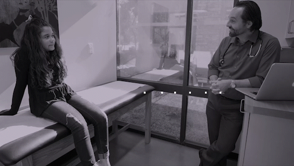
Above, is a video presentation of some work that I'll refer to as Round 2. I developed motion assets that were meant to be used across many platforms, from an app to the Athena website and even for marketing videos.
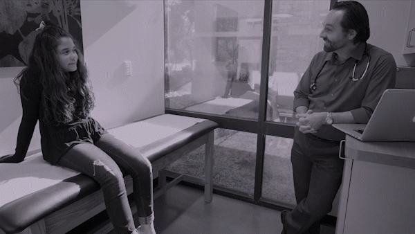
Below you can see Round 3. If you watch both you can see a progression and narrowing down of options as the internal team decided what worked best for their purposes.

We explored a few different options while developing the aesthetic for motion in video.
And more icons!


