Here's a little taste of what I've been up to for the past couple of years. Working at Shopify has allowed me to collaborate with some of the most talented motion designers, storytellers, UX'ers, content designers, and all-around creatives. We are constantly shipping new ideas, products, and initiatives that push the boundaries of what we can do as individuals and as an entire company.

This became the official logo animation used by most of Shopify's marketing. This seemingly simple animation is the result of weeks of exploration and testing. Great attention was given to the stretching, overlapping action, and follow-through of the bag handles - all in order to bring the bag to life through the addition of some fun character. When it comes to my job, establishing the foundational principles of a brand's motion language has to be one of my favorite tasks. This is one area where I love to get lost in the weeds. Send me to the weeds please, like, all day... make that all week.


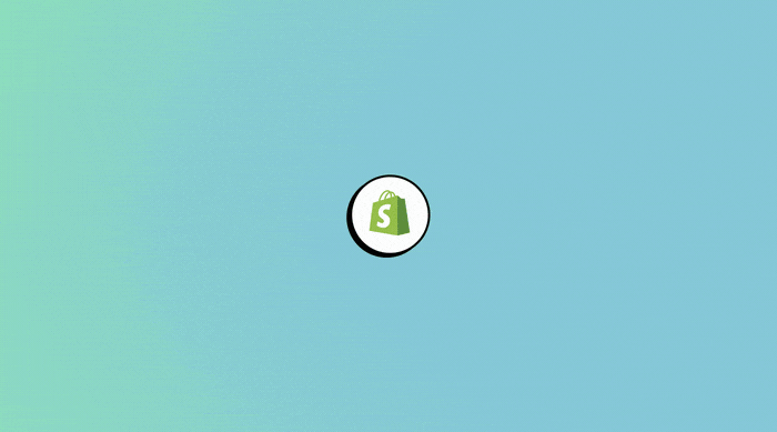
As part of the brand exploration, I created a few gradient icon animations to be used on various platforms. The subtle 3d rotation gives life to the shopping bag and makes the movement more dynamic.
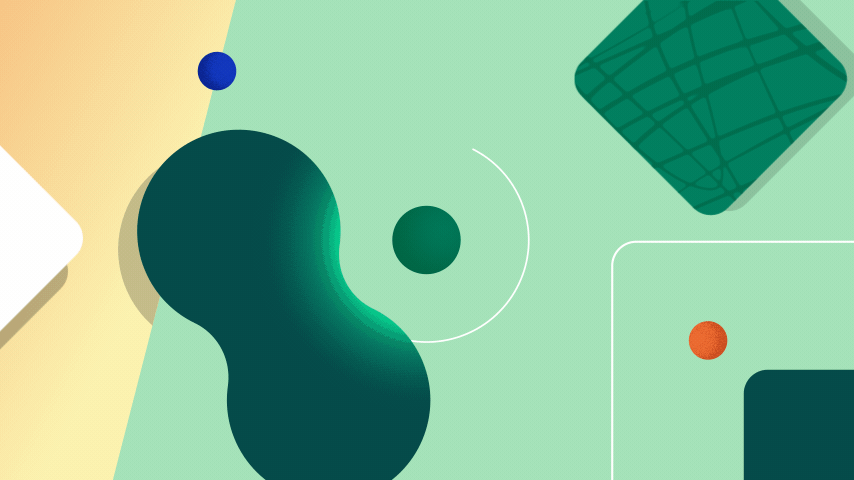
Part of the work I and a few others manage throughout the year is establishing and refreshing a set of motion guidelines that the rest of the organization can follow and utilize for any given project. This helps build for the long term as brand consistency becomes stronger. The type of assets might range from more expressive abstract shapes (like above) to more prescriptive type animation guides.
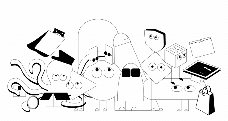
Sometimes I get to work with an extremely talented illustrator to bring some fun characters to life, like the above! Other times, like below, I might be creating a quick animation to cover the time it takes for a landing page to load up. Both of these examples are meant to add some levity and delight to the user experience but are very different in execution.
See the landing page or Behance project here! I also worked on many of the small motion elements throughout this page.
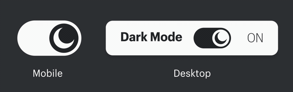
It may be a small example but it's one that I'm proud of and represents the care for our users that's infused into everything we do. Since Shopify serves an incredibly large global audience, accessibility is extremely important. Like this light/dark mode button, much attention is given to the UX associated with every experience we design. Here is the landing page that this element was specifically designed for. I also helped out with some of the visual design on this page.
________________________________________
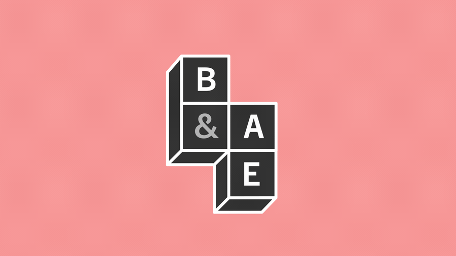
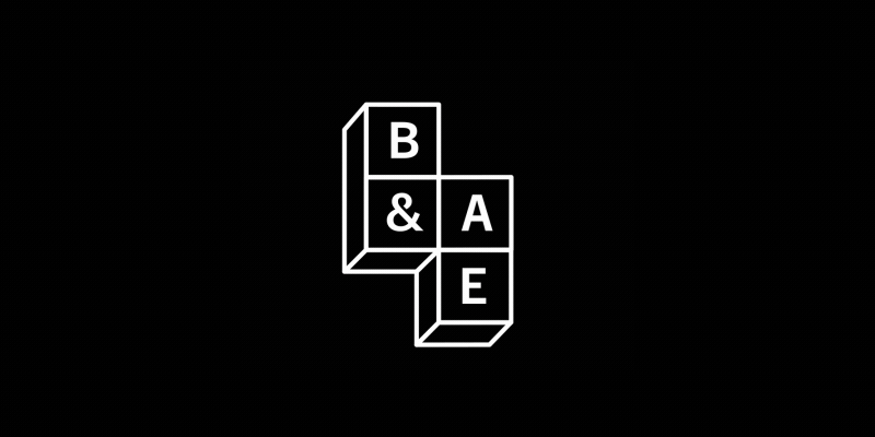
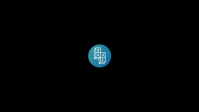
Here are some fun logo explorations for an internal team that I had the pleasure to be a part of for over a year.